Game Design UX Best Practices
March 2, 2023
Summary
This article is as the name suggests and talks about good game design practices. One thing the author focuses on is UI positions and utilizing it to make users spend money, which is an example of dark UX. The deisgners figure out the easiest areas for a user to reach and put things such as shops and ads near there to prompt the user to activate and purchase something. Due to the limited screen space, games use sliders to fit information. Games like to include pop ups to show hidden animations and include interactive elements such as asking the user to make a choice. Please note that "X" is associated ith annoying content so instead of using an "X", consider using a button instead. Use rewward videos to create a win-win scenario where you get to earn revenue and the player gets free gifts. The article goes on to talk about a few other best practices.
My Thoughts
I noticed a lot of these best practices while I played games but a few such as not including an "X" button and the positioning of the "rate us dialogs" were surprising to me. It goes to show how design really is not just UI aka aesthetics but involve a lot of design-thinking and UX. Articles like this compel me to continue exploring this fascinating field. Similar to the author, I want to use these design thinking skills to create functional products to seamlessly help usesrs accomplish their desired tasks.
Visual Thinking Analysis
February 16, 2023
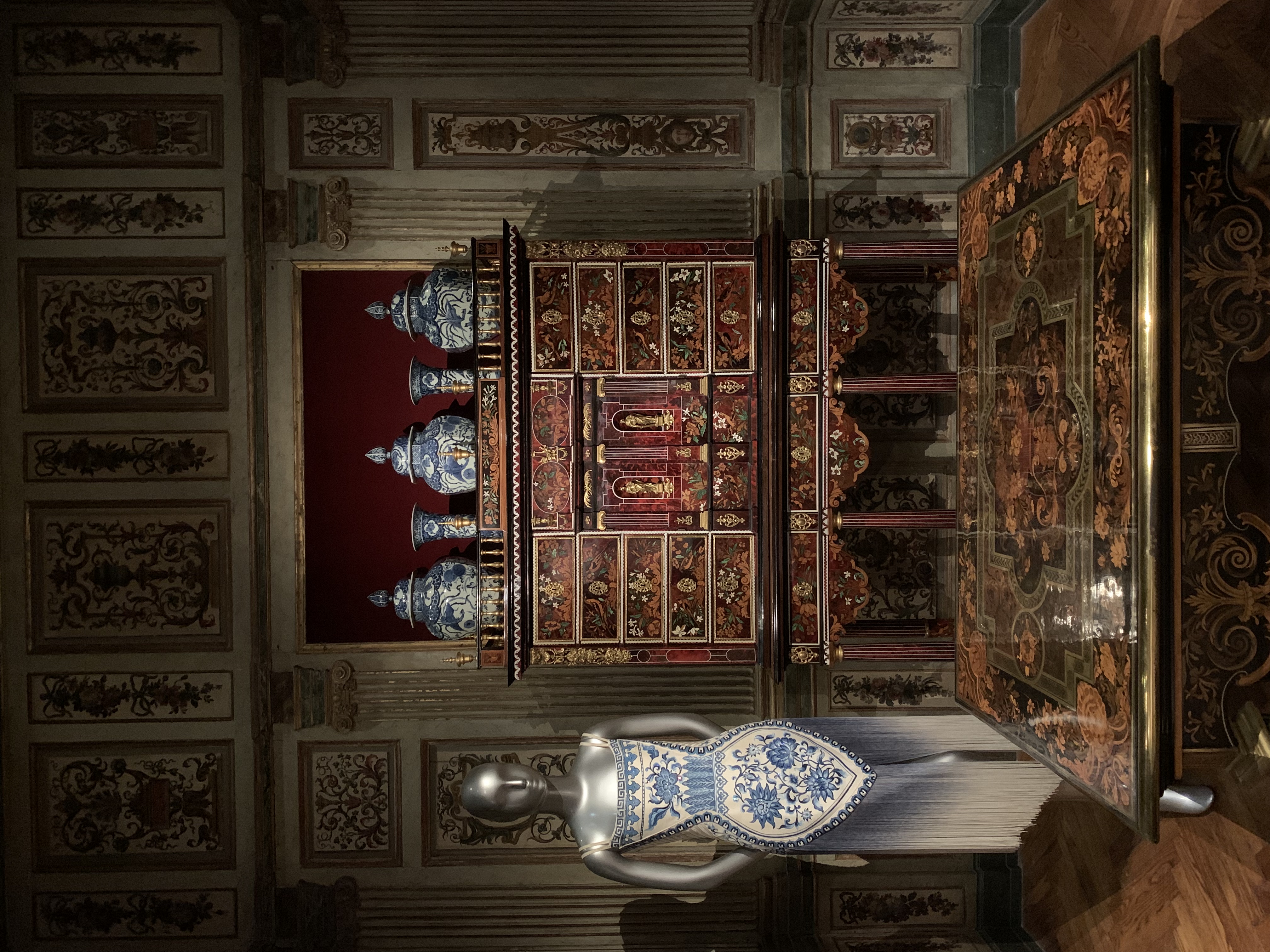 Fig.1 - Cindy Lee, 2022.
This is a photo I took at the Legion of Honor Museum's Guo Pei: Couture Fantasy - de Young Exhibit. At first glance, the photo seems very Chinese; however, it is actually comprised of items from three countries: China, Japan, and France. The vases on top of the cabinet were created in Japan but the style and technique derives from China and is known as the coveted blue and white porcelain. This style of porcelain gained great popularity in Europe beginning in the 16th century. The blue and white porcelain style was reimagined into a stunning dress by the fashion designer, Guo Pei, which could be seen on the left. The cabinet the porcelains sit on top of is from France and the interior is European style. This image nicely captures Guo Pei's strong Chinese influence but also love for European court style. It shows global interaction and cross border overplay.
As a Chinese Studies, International Relations, and Design triple major, this image very nicely encapsulates my areas of interests. I love Chinese culture, history, and art, thus I love the look of blue and white porcelain. I have a great interest in globalization, so I love learning about the relationship between different countries and the spread of different cultures. And finally, as a design major, I love visting museums to learn and experience various types of art and exhibits.
 Fig.2 - Allyson Wu, 2022.
This is an image that looks like an ad for Tatcha, a skincare brand. I really like how the photo has the products submerged in water, which ties in really with the brand's reputation for being highly moisturizing and made with clean ingredients.
I think it shows the logo and names of the products very clearly, so the topic of this image is very clear. I am curious about what this photo was used for. Was it used for an advertisement?
Visual Thinking Skills
February 8, 2023
Summary
The article "10 Intriguing Photographs to Teach Close Reading and Visual Thinking Skills" by Michael Gonchar, gives tips to practice visual thinking skills. It encourages us to be curious and observant when looking at images and making predictions about what they are trying to convey.
My Thoughts
This article reminds me of the saying "A picture is worth a thousand words" because it shows that a single image could have an endless amount of interpretations. Visual thinking exercises through observing images makes me more cautious about even the smallest details for my own designs because even the smallest details could deliver a great amount of meaning.
Example of Interesting Usage of Images
Resonant Link, a wireless charging company, uses images in an interesting way to showcase their products on their website. On the page about implantable medical devices, they first use a huge image that takes up the whole screen of a medical professional holding a tiny, in focus medical device. It looks so tiny and minute relative to the person holding the object to emphasis its size. When you scroll down, this tiny device expands to show all the components within the device to help viewers better understand the product and further draw attention to the many details that make up this product. Finally, the last image on the page shows the device in action as it is used on a model to show the impact and usage of the product. It uses different tactics such as blurring, focus, scale, and more to draw attention to different details of the product. In addition, the page uses three images to show the process from the design/source to the distributor to the client to help viewers better understand the product.
Best Practices for Modals and Overlays
February 5, 2023
Summary
In the article "Best Practices for Modals / Overlays / Dialog Windows" by Naema Baskanderi, Baskanderi shares that due to the overuse of modal windows, users now find them annoying and instinctively ignore them.
Modal Window: An element that sits on top of the main window. The user must interact with the modal window in order to return to the main window, but the main window is still visible.
When To Use: An element that sits on top of the main window. The user must interact with the modal window in order to return to the main window, but the main window is still visible.
- Grab user's attention
- Need user input
- Show additional information
My Thoughts
Prior to reading this article, I mainly referred to modals as overlays. Though I use modals in my designs often, I was never taught when to use them. Now that I know when to use modals, I will be more careful of when I use it and be sure to include essential components such as an escape hatch, title, button, and etc. for a good user experience.
Best Form Design Practices
January 31, 2023
Summary
Form design is one of the key task for a product designer to create simple forms that convert. In the article "Best practices for form design" by Salim Ansari, Ansari shares that a good form design must do the following:
- only ask relevant questions
- be in the one column format
- reduce cognitive load by breaking up into multiple steps
- ask simple questions first
- distinguish between optional and required fields
- explain and show the format requirements
- Include lables that are always visible
- Include placeholder text that are always visible
- Adaptive size fields
- Be careful with default values
- Auto focus first input fields
- Minimize the use of dropdown menus and use radio buttons or checkboxes instead
- Making a form tab ready
- Provide matching keyboard
- Explain the need for asking certain sensitive questions
- Provide show password option
- Have clear, effective action buttons
- Never include a reset or clear button because it might accidentally delete their whole form
- Create accessible forms through proper color contrast, ability to control text size, enable screen reader, and don't rely on color as the only visual means to communicate
My Thoughts
Reading this article made me realize how important everything single detail is to creating a seemingly simple form. It really goes to show that good UX design is invisibile because I never noticed these differences until they have been pointed out. It also makes me reflect on forms that I designed and how I can improve upon them in the future.
Example of Good Form Design
One example of a well designed form is the Google Account Sign Up Form. It is super short and only asks for five things. The placeholder text shifts to the top to remain visible when the user begins filling out the field to ensure they always know what information they need to input. For the email field, they include a short description of values they can use. For the password field, they include requirements that can always be seen below the field and there is a show password option. The action button is also clear and visible.